> For the complete documentation index, see [llms.txt](https://docs.decentraland.org/llms.txt). Markdown versions of documentation pages are available by appending `.md` to page URLs; this page is available as [Markdown](https://docs.decentraland.org/creator/scenes-sdk7/2d-ui/ui_input_binding.md).
# UI Input Binding
Bind input actions to your own UI elements so they drive player input.
`UiInputBinding` turns any UI element into a control button. Bind an element to one or more [`InputAction`](/creator/scenes-sdk7/interactivity/button-events/click-events.md#pointer-buttons)s, and while it's pressed — by touch or pointer — those actions are held down, driving both the local player's input (movement, jumping) and any scene [`InputAction`](/creator/scenes-sdk7/interactivity/button-events/click-events.md#pointer-buttons) listeners, exactly like the native on-screen buttons.
Use it to build your own touch controls. It's typically paired with [On-screen Controls](/creator/scenes-sdk7/interactivity/touch-screen-controls.md): hide the native buttons, then put your own in their place.
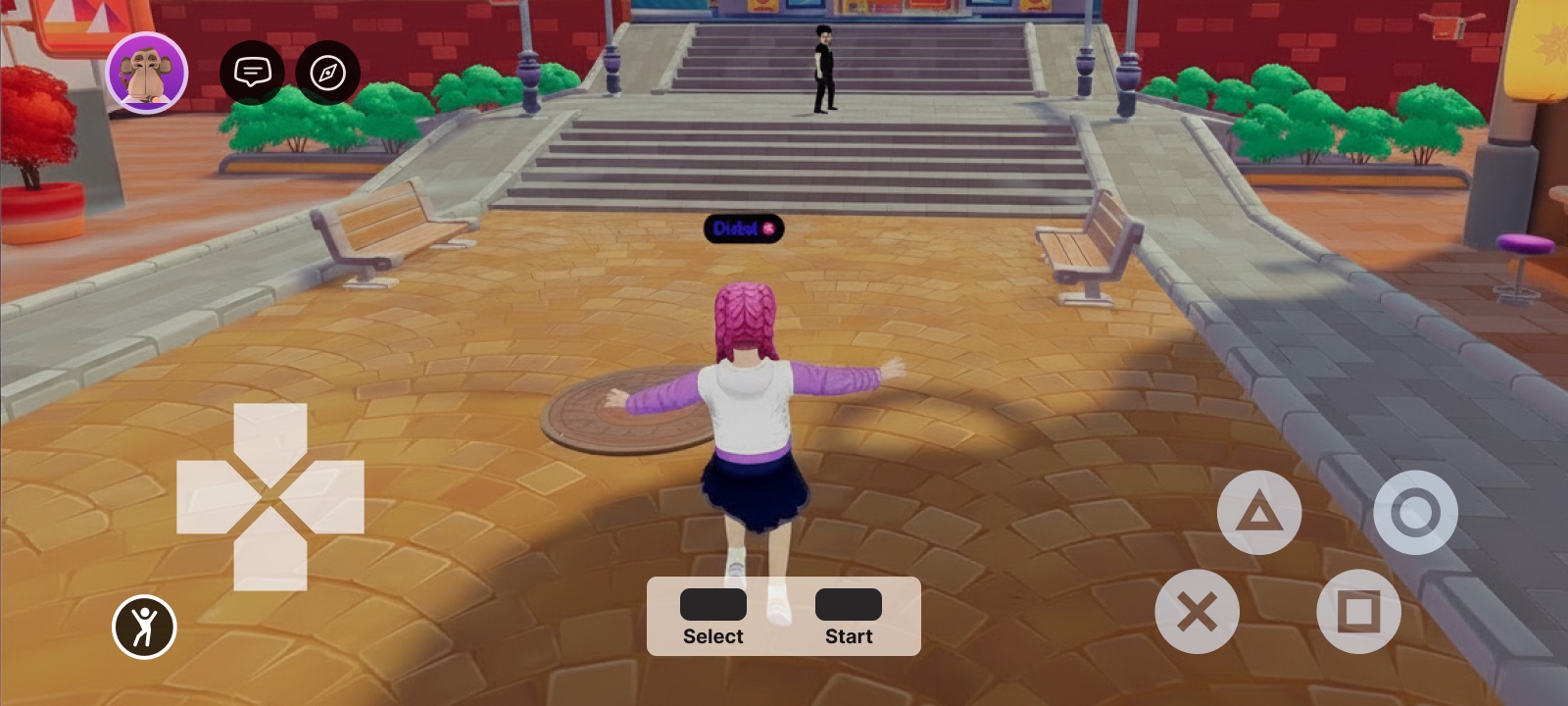
A fully custom gamepad built from UI elements — each button is a UI entity bound to an input action
## Bind an action to a UI element
Add a `uiInputBinding` prop to any element in your `.tsx` UI and list the actions to hold while it's pressed. The prop is available on every UI element ([`UiEntity`](/creator/scenes-sdk7/2d-ui/onscreen-ui.md#ui-entities), [`Button`](/creator/scenes-sdk7/2d-ui/onscreen-ui.md#ui-entities), [`Label`](/creator/scenes-sdk7/2d-ui/onscreen-ui.md#ui-entities), …), just like `uiTransform` and `uiBackground`.
**A button that moves the player forward while held:**
```tsx
import { InputAction } from '@dcl/sdk/ecs'
import { Button } from '@dcl/sdk/react-ecs'
export const forwardButton = () => (
)
```
## Build a custom control cluster
Combine several bound elements to assemble a full control scheme.
**A movement button plus an action button that fires `IA_PRIMARY`:**
```tsx
import { InputAction } from '@dcl/sdk/ecs'
import { Button, UiEntity } from '@dcl/sdk/react-ecs'
export const customControls = () => (
)
```
The bound actions behave just like the native buttons: `IA_FORWARD` / `IA_BACKWARD` / `IA_LEFT` / `IA_RIGHT` move the avatar, and any action can be read by your scene's [`InputAction`](/creator/scenes-sdk7/interactivity/button-events/click-events.md#pointer-buttons) listeners. Removing the prop (or the component) releases the binding.
## Properties
| Property | Type | Description |
| --------- | ---------------------------------------------------------------------------------------------------------- | ------------------------------------------------------------------------------------------------------------------------------------------------------------------------------------------------------------------------------------------------------------------------------ |
| `actions` | array of [`InputAction`](/creator/scenes-sdk7/interactivity/button-events/click-events.md#pointer-buttons) | The input actions held down while this element is pressed. See [Click events](/creator/scenes-sdk7/interactivity/button-events/click-events.md) for the full list of [`InputAction`](/creator/scenes-sdk7/interactivity/button-events/click-events.md#pointer-buttons) values. |
{% hint style="info" %}
Pair this with [`TouchScreenControls`](/creator/scenes-sdk7/interactivity/touch-screen-controls.md) to hide the native controls and replace them with your own touch UI — the recommended way to ship a fully custom control scheme.
{% endhint %}
## Related
* [On-screen Controls](/creator/scenes-sdk7/interactivity/touch-screen-controls.md)
* [UI Button Events](/creator/scenes-sdk7/2d-ui/ui_button_events.md)
* [Input on mobile](/creator/build-for-mobile/develop/input-on-mobile.md)
* [Click events](/creator/scenes-sdk7/interactivity/button-events/click-events.md)
---
# Agent Instructions
This documentation is published with GitBook. GitBook is the documentation platform designed so that both humans and AI agents can read, navigate, and reason over technical content effectively. Learn more at gitbook.com.
## Querying This Documentation
If you need additional information that is not directly available in this page, you can query the documentation by asking a question.
Perform an HTTP GET request on the following URL with the `ask` and `goal` query parameters:
```
GET https://docs.decentraland.org/creator/scenes-sdk7/2d-ui/ui_input_binding.md?ask=&goal=
```
`ask` is the immediate question: it should be specific, self-contained, and written in natural language.
`goal` is what the user is ultimately trying to achieve, the reason they need the answer. Sharing it helps GitBook give you a better, more relevant answer. A goal is most helpful when it describes the outcome the user wants rather than restating the question. For example, with `ask=how do I create an API token`, a goal like `automate deployments from our CI pipeline` lets GitBook tailor the answer to that use case.
The response will contain a direct answer to the question and relevant excerpts and sources from the documentation.
Use this mechanism when the answer is not explicitly present in the current page, you need clarification or additional context, or you want to retrieve related documentation sections.